Before starting on the discussion, let me wish you all a Merry Christmas and a very Happy New Year. 2011 is near and so is the designing business for special calendars. Introducing before you are a variety of innovative concepts and exquisite designs that is sure to make you catch your breaths. So enjoy the Christmas-New Year feast.
Its Christmas time and holiday season again. So why not change your rusty wallpapers and have some fun designing one of your own. Let that be a card, a signature, a poster or anything as you please. What I would provide is a bit of inspiration and many a backgrounds to act as your work canvas.
You might have across the RGB, CMYK mode and wondered what these are used for. I did not have any knowledge regarding these until one of the posters I designed was sent back citing the mode was wrong. And thus I decided to learn the valuable lesson about various modes of designing in Photoshop. Making it as simple as possible and condensing everything into a few lines, here is how you use it. (You can select the mode in the menu from Image>Mode).
RGB
Red, Green, Blue mode is used primarily for digital photos and those designated for computer screens like webpage graphics. Inkjet printers also use the same.
CMYK
So this is the one to select if you are doing the work for print purpose. All offset printing use this mode and so is for high-end inkjet printers.
Grayscale
This is the usual Black and white which can be used for both purposes mentioned above- printing and web-based images.
Indexed Color
This mode limits your color selection to 256 or a Color table. This is used for web-based images where the size of the image needs to be limited by saving it as GIF or PNG8 especially in case of buttons and banners.
Lab Color
Lab mode is used only when you need to use some filters like Sharpen filters (which will of course be prompted). We have to change the mode back to RGB or CMYK before saving the work.
Duotone
Meaning two color tones used throughout your image, it is used solely for commercial printing purposes, but not on inkjets.
Bitmap
Bitmap is simply Black and white and the difference is there are no gray tones in between as in grayscale. You can use it anywhere, but the image always looks so.
Multichannel
It is similar to duotone where premixed colors are used. It is used for commercial printing purposes and mainly for logo designing.
But always remember that changing from one color mode to another reduces the quality of your image and hence need to be done beforehand. Moreover, converting back to your original mode does not retain the original quality.
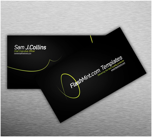
This is one of the easiest thing in designing. But you can make it more complicated as your creative ideas grow. But it becomes too easier when you have the whole template with you. Just download these templates and you have your personal business card with you. Leave the contemporary styles and do the new and be the new. So without much talk, moving on to the designs.
Stylish Business Design Layout Dimensions: 2.25×3.75 inches
Business Card Dimensions: 2×3.5 inches
Resolution: 300dpi
Graphics on a smaller scale is graphic signatures. Hence it can be attempted by beginners as well as experts in the fields. How about giving a list of the signatures that I found wonderful from among the millions. And if you want to learn more about them, follow the links or this forum: Layeredgfx
Abstract Signature
Learn how to create a detailed signature using several filters and effects.
Being presented as a part of my last post on newspaper, infographics needed a wider coverage and a bit of detailing. Since newspapers, web-portals and even governments are adopting it as a form of mass communication the question of relevance is unnecessary. Continuing on my inspiration season posts, do read this one or as a matter of fact just view this one. From the countless number of infographics here are the few I found which could be inspirational as well as useful.
I have never thought newspaper as a target for designing. But I understood that all my predispositions were misplaced when I recently came across a Behance article. It was about redesigning one of the popular newspapers which I read daily and spans whole 16 pages into a single page paper. Though I have ogled a lot about the projects for the architecture and designing students, I was really astonished with this creative endeavor (may be I haven't seen enough of the design web). Anyway please do have a look at the project: Behance:Express-Newspaper
As usual rest of my day was finished in finding the best of newspaper designs around the world and I have found a few. The ones that touched my tastes are listed here. Do comment on the ones you like and the ones you have found elsewhere.
Awarded the Europe's Best Designed Newspaper which can be called the Oscar in Newspaper design. The use of easily comprehensible graphics is adopted as you can see in the online newspaper from the site of this Flemish paper.
Always thought about modifying your logo, banner or poster. Here are a few simple steps by which you can change the just simple looks. Those creative artists have done everything for you, you just need to follow suit as per the instructions provided. Take up the challenge and it will never leave your time unworthy. I have read most of my basic Photoshop and Flash lessons just by redoing those instruction may be a number of times till everything works out. Click the links and go to the websites.
August 6th, 1945. The date is etched in our minds and without much introduction travel through these images and photographs which tell the story of a people, of generations, of a war, of a rebirth, of a revenge and of the world. They will tell you that graphics can speak and graphics can act. Click on the images for links to the original sites.
Typography is in itself a revolution and in general one in the field of designing, and meanwhile a revolution is currently going on inside the typography sector too. The ideas and inspirations has been ever circulating with widespread digitalisation of the designs. I would like to share with you few of the most revolutionary ideas in the typography sector. Play with the words, but ultimately select the best. Click on the images for the links.
With the advent of the digital graphics, nothing have gained as much importance as typography. It has been reigning over the rest of graphic media through this decade. It has been helvetica, helvetica and helvetica that you have been seeing all the while.
What about a altogether different concept. Handwritten fonts are rarely used and good ones are rare to find too. So wouldn't it be better if I try to share a few of the best handwritten fonts available?
Formally included in the Brazil fans in the college, we had a lot to do in order to cope up with the fanfare of the Argentineans. Being a Brazil fan is easy, but being a designing enthusiast as well as a Brazil fan is not. It was a rather difficult task checking out the web some high quality images for preparing some posters and ultimately I had to give up. But meanwhile, I had come across a few graphic websites which offer a few better opportunities and collections. The best may not have been yet found out, but ideas and inspiration still glows behind them. A collection of designs, rendering, signatures, PSDs, wallpapers all exclusively for sports...
Fascinated by a TV news featuring Shanghai World Expo 2010, I had been exploring the country pavilions which are marvelous symbols of architectural beauty. With a theme of 'Better City, Better Life', most of them are one better than other. Though I have not yet intended to feature architecture in this design portfolio, it would be a crime not featuring these beautiful models. Check out the best of Shanghai and vote and comment for your best.
I would love to share one of my recent creations with you. It was a poster for the release of a magazine in our college. Though not so perfect in any sense, it was a work which took just several minutes from a day. And I believe it is not that bad either.
So I had earlier decided that my next poster or brochure would be something based on the transparency effect. The inspiration behind this was the simple picture shown below, just the difference in its tones. It was much more beautiful than what I had done (but I had to move on with a theme background for the magazine).
Paper artwork is something one thinks of a sheer waste of time and possibly an unwelcome source of revenue (rather cheap). But designing is taking into new forms with origami paving way for these colors and curves. These do find their place in the charts of excellence and among the cover designs of books and albums. Creating an idea and designing it with paper, I believe, needs courage in addition to creativity.
I am actually afraid as the undo key is not available here and much of my efforts may go in vain if I try one of these. The X-factors should play the perfect role to make it come attractive. The fact is that you can find much unattractive ones in the net. So selecting the best is simple but rather time consuming, though only a few create such ones. So here are a few selection of mine.
Here are my second set of concept design backgrounds that would surely be of use to you. Stain it, spill your paints, airbrush it and take it to the horizon to experiment with your art work. Without blah..blah... download it..
Thanks to PSD graphics for the pretty good designs.
Going through the Smashing Magazine Edition of the India special photography series, I thought it would not be a crime copying the idea and creating a similar post. After all I am an Indian and I have seen enough of it to introduce before my readers. India for centuries have been believed to be the land of fakirs lying on nail beds, street magicians and snake charmers. But I have never been able to witness any of these so called 'common' sites in my entire life. Here are the colors and culture of India that makes it all too attractive and important to me. Celebrate.
Art is creativity. Art is contemporary. And art gets meaning when it means something to the observer. So here are a series of photos which are extra-ordinarily brilliant in every sense it is. The photographs of the most recent eruption of the volcano in Eyjafjallajokuli (sorry, if it is mispelled), Iceland is an attempt to take news photography into greater heights.
So if you got stranded in some airports or in your rooms with your flights cancelled, do take your spare time in checking these photographs which might cool down your mind a little in spite of the heated eruption and lava.
But do take care of your lungs and throat as the WHO has issued a health warning regarding respiratory problems.
Linking to the original article with a sample picture.
When you have created the blog of your choice and written down the articles, the next thing that worries you would be the image in the post. Images pose an important means of attraction towards your blog post and hence should be given more importance than your post itself. Copying it from the source of your article is unworthy, when you can provide a new idea of your own.
1. Try working your creativity and make some humor out of it. Finding the idea would be more difficult than finding the right image. You have tons of these suiting any of your search criteria readymade for any situation. These custom made images can add a unique feeling to your blog and even the individuality you needed.
Wouldn't you like to add an awesome rainbow to your photos. A simple but effective tutorial would guide you through all the steps. Its easier than ever before.
This photoshop tutorial would be more effective if you try on the sample image they had provided. And later you can try on your own. Get on...
This is an opportunity at hand for you designers. Switch on the bulb and get yourself into action designing the most worthwhile of your creations.
Mediabistro logo awards 2010 has extended its entry last date to April 30.
Meanwhile I am just checking into some of the best entries in the list.
The competition is not tight as you can see from the number of entries, but the media partners are one of my favorite abduzeedo may the glory be to you.
I had been collecting wallpapers and design backgrounds for about a year or so. And I believe it has some of the best I found over the net. Well, it would be unworthy if I dont share it with you, since using them is just my distant dreams. More than just wallpapers, these could be creatively used to make your face or ideas come lively over the screen or print.
And I hope you could also grab many of these ideas too as they are innovative and too attractive not to have a look at them. So check out and comment. Download link below


.jpg)


 This is an opportunity at hand for you designers. Switch on the bulb and get yourself into action designing the most worthwhile of your creations.